Before diving into the details of your landing page, it’s always a good idea to start by outlining its content structure. Without this foundation, you risk getting lost in unproductive discussions with your team.
A landing page used in the acquisition phase of pirate metrics should be designed to align with the AIDA model—Attention, Interest, Desire, and Action. Think of it as a funnel that guides visitors through a journey, helping them discover and engage with your service. Start by grabbing attention with a clear, compelling headline or question that speaks directly to your visitors’ problems. This sets the stage for the next step: sparking interest. Describe their problem in a relatable way, then introduce your service as the solution. Using bullet points here keeps the information concise and easy to scan. To build desire, reinforce trust by showcasing customer testimonials, certifications, case studies, or any other social proof that reassures visitors of your credibility. These elements help visitors see the value in what you offer and imagine the benefits for themselves. Finally, prompt action by providing clear, prominent calls-to-action at the end of the page—whether it’s a sign-up button, a contact form, or a link to learn more. The goal is to make it effortless for visitors to take the next step. By structuring your landing page this way, you create a seamless path from curiosity to conversion.
To measure the success of your landing page, include call-to-action (CTA) elements—such as buttons or links—that guide visitors toward specific actions. For example, when a visitor clicks the Sign In button in the header, they are redirected to your service’s authentication page. This interaction is recorded in your web server’s log files, allowing you to analyze which CTAs are most effective.
Every server action—whether it’s a click, form submission, or navigation—provides valuable data to help you understand how your page is performing. While I won’t delve into technical details here, tracking these actions is essential for optimizing your landing page’s effectiveness.
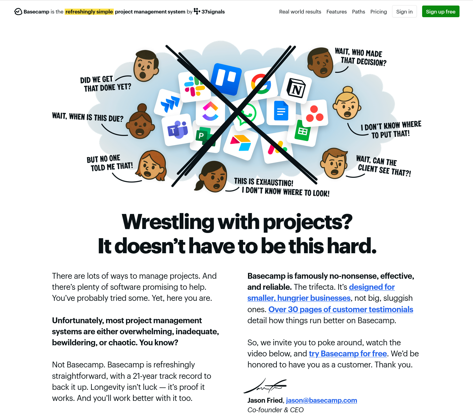
Basecamp has very successfully implemented the AIDA model right from the start of its homepage. Let’s first look at the Attention Phase: the core message of Basecamp is graphically visualised, immediately showing visitors that they differentiate themselves from the competition and which pain points they address. This clearly positions Basecamp against the competition and highlights its own value proposition without explicitly mentioning it. Basecamp uses the narrative technique ’Show, don’t tell’ here – but with a cheeky twist: it doesn’t show what it can do, but what the competition can’t. Our brain remembers negative stimuli (frustration) more strongly than positive claims. Without describing features or using complicated technical descriptions, Basecamp manages to convey the message to its visitors: “Look! We are the alternative to everything that has frustrated you so far”. The entire illustration aims to make visitors to the homepage identify more strongly with Basecamp and its “mission”.
In the headline, visitors’ pain points are formulated as a question and concisely brought to the point. This forces the reader to inwardly answer “Yes!”. Visitors receive confirmation that “Projects are exhausting,” which leads to more trust in Basecamp, as visitors feel understood. The statement “It doesn’t have to be this hard” is a hint at a solution and is intended to arouse curiosity in visitors, who might then ask themselves: “How then?” and be inclined to read on. In the Attention Phase of the Basecamp homepage, negative elements are deliberately used to evoke strong emotions in visitors.
Then follows the transition to the Interest Phase, where on the left side, the problem that Basecamp solves is discussed in more detail, and criticism is levelled at competitors without explicitly naming them. Here, the opportunity is also taken to implicitly position oneself as an authority: “Everyone else is doing it wrong – we are not!”. The reference to 21 years of success is intended to underline this claim to authority and further build trust.
On the right side, the desire and action phases come together. Basecamp describes how it solves the problem and directly refers to concrete, quantitatively measurable customer testimonials (social proof), as well as the possibility to try out the solution without having to take a risk. The inhibition threshold for action is very low.
Of course, it’s likely that Basecamp invested in a professional marketing team or agency to create their polished homepage. However, you don’t need a big budget or a team of experts to develop an effective landing page.